Friday, April 27, 2012

12. The Final Presentation


Presentation Script Below
  1. INTRO START: Bicycles have always assisted the community to reach point B. As a clean and environmentally sound method of transportation and exercise, bikes provide us with a cost effective alternative to the gas guzzling world of vehicular travel. (slide 1)
  2. It's a refreshing and liberating experience, cruising along the city streets, open to the rushing air. Your view is unobstructed by windows and metal. But that poses a great threat to us cyclists. (slide 2)
  3. We are vulnerable to those still using cars vehicles, and without a safe barrier between us, there will always be conflict between drivers and riders. (slide 3)
  4. Warning signs, lights and reflectors, and hand signals can only do so much out there on the tarmac. The cycling community suffers from an unending and desperate need for bike lanes.
  5. (slide 4) And while there are lanes installed though many cities, the department of transportation doesn't have sufficient and reliable information to place them efficiently. 
  6. (slide 5)They need data from the inside. Bike riders need to unite to form a system, a collective concerned for bike safety, and that have an insider perspective on just where these unsafe roads and intersections are.
  7. So as a graphic designer, the questions is: "Through design, can I create a tool, using information generated by the bike community, that can be used by the Department of Transportation to more effectively place and regulate bike lanes throughout a city."
  8. The bike community needs HUB. (transition to title slide) (then transition to schematic of system screen)An online GPS system utilizing smart phones and RF bike mounted stickers to not only track where cyclists are riding, but to collect their safety concerns and accidents to determine where routes should and will be installed by the department of transportation.
  9. (Transition to Personal Image) This is Paul. Paul rides  to and from his part time job, and attends business classes at Kansas University. Cycling is all about conquering the gas pump for him, and he enjoys that rush he receives after riding to the top of KU's tallest hills. He's a commuter at heart, and needs to get from place to place rather quickly. This is where Hub comes into play.(Transition to Hub screen.)
  10. Before heading to work, Paul as a new user will first need to sign in. The app can later save his information, and keep him logged in, so as to save him time in preparation before his rides. (Typing and submitting)
  11. Once logged in, Paul has the decision to either track a new route to be saved for him, or he can continue to the map in the application, showing previously ridden routes. His current desired route to work hasn't been tracked yet, so he touches the first tracking option. 
  12. When riding or tracking a route, the user's interaction is limited for the cyclist's own safety. Paul simply taps anywhere on the screen to start tracking his new route, and later when Paul finishes his route, he taps once more anywhere on the screen to stop the tracking. 
  13. After his ride, the app asks Paul if he encountered any safety issues. He always has issues around the same spot, and touches yes.
  14. The app continues to his visualize his route overlaid on a google map of his area. The map is depleted of any color, and with this stark black, white, and orange color scheme, (show outdoor image) users like Paul can use HUB both inside and outside with little trouble. (Fade back to map screen)
  15. It prompts Paul to touch where on the route he encountered his hazard. He remembers it about hallway between 49th and 50th street. (touches)
  16. Having taken a photo of his hazard earlier, a series of potholes in the road, he selects the camera, and brings up the photo he wishes to upload. After selecting it, HUB brings up the keyboard to type a comment with it. Paul posts the comment, and it takes him back to the map page. The safety rating icon in the top left flashes to show that his comment has dropped his route's safety rating, and the new image is masked within the safety point he plotted on the route earlier.
  17. While HUB relies on the bike community for it's data, The Department of Transportation still has a large part to play in the system. While at work, one of the members of the transportation department signs on, to view new user safety postings.
  18. The system lets them view this information by searching for a particular area by zip code, or by a certain safety rating. This user selects the zip code search option, and enters the number for the plaza/ main street area of Kansas City, which he is in charge of maintaining.
  19. The map page loads, and any safety hazard posted by the bike community is shown along marked roads. The largest ones with the 1's show which roads have the lowest possible safety rating, and it's those road this worker is most interested in. He selects one...
  20. and it expands with all user comments posted on that road, as well as their photos. After looking through the comments, the Department user decides this road needs lanes installed, and general maintenance. So to the right side, he enters the estimated completion date for the lanes, and submits it for all HUB users to see and anticipate.
  21. Later, while Paul is out riding, his phone buzzes with a new notification. So he pulls over to a take a look. He enters the app, and a new notice icon flashes at the bottom on his routes icon. He touches it to see what's new…
  22. The top street bar expands downward, and presents him with the new lanes expected to be put in on his route. Relieved and anxious, he continues his afternoon ride, happy his morning commute will be that much safer in the future.
  23. The next morning, Paul pulls out his iphone and enters the app. It takes him right to the tracking screen, but rather than tracking a new route, he continues into the app to select the route to work he tracked yesterday…
  24. In his "routes section" he can view the other routes he added yesterday afternoon, and the days before. He can pan around and select routes simply by touching them. He can also select the route icon on the bottom bar, and view his routes in a list format. This arranges his routes according to those most and least ridden. But preferring the regular map view, he exits the list view and touches the route to work. 
  25. Once the route is selected, it asks if he's like to start the ride, and he hits yes. However this time a new safety notice pops up. HUB has found a safer route that can get him to his location more safely, and in more quickly to boot. Paul can't argue there, and decides to give the route a try.
  26. It takes him to the tracking screen, and he touches to start his ride. Much like the GPS units for vehicles, HUB offers him voice turn by turn directions to help him along. 
  27. But near the end of his trip, he get's a bit turned around at an intersection, and stops to get his bearings. HUB detects that he's stopped, and asks if he'd like to see the route map to reorient himself. He hits yes…
  28. On the map screen, his position is shown on with the route, and he can see which direction he is facing. When he's ready, Paul continues his ride. HUB notices he's now in motion again, and returns to the tracking screen, providing him with those turn by turn vocals until he reaches his destination. 
  29. He stops his tracker, and hasn't encountered any safety issues. 
  30. It asks if he would like to save the new route. He loved the new route, and adds it, knowing that his other route will always be saved if he want's to ride his old way to work.
  31. HUB users can always highlight a route and expand it's top bar to view in depth information on his tracked rides, including distance,  the safety rating, how many times they've ridden the route, and the average ride time it takes to get from start to finish.
  32. But while maps are useful, some users like Paul enjoy seeing their information at their level, as a civilian on the streets. So he selects the augmented reality icon at the top left. 
  33. This opens the street view, allowing him to view the surrounding area through his phone's camera. He can see the safety hazards that other users have posted in the physical space around him, and can enter one of those postings to see the user's comments and photos of the issue. Paul can even toggle HUB to view bike lanes installed around him, or lanes that are expected in the near future. Always on the lookout for a new safe trip, Paul plots a route to the nearest bike lane for later, and heads into work.
  34. HUB builds a relationship between the Department of transportation and the bicyclist community. With so many bicyclists out there, lanes must be strategically placed, and by utilizing cyclists throughout the city, HUB will push the road safety system into a new world of mobile GPS technology. Bike riders will shape a safety network for themselves, and HUB would ensure their voices for new lanes and repairs would be heard and respected.

11. The Active Camera


So when designing the HUB application, little consideration has been payed to the camera functionality of the iphone platform itself, and what role it can play in not only submitting user information to the HUB system, but how it can show information to the user. I've returned to that concept of the camera as an eye, and considered it's role in the process of uploading safety hazards. Users in HUB can now upload a photo to accompany their comment, giving the Department of Transportation vital visual data on what the issue was, where it was exactly located should the user have misplaced the point of the issue, and to give that users comment a bit more authority over users that don't put in photos with there comments. It shows that extra step in effort for a user desiring change in the bike safety network, and gives other users viewing their safety hazard posting a bit more insight.

Photos however aren't the only method of visual data that will be at the user's disposal. Augmented reality and recorded video is a great method to place posted user info in the physical space around the user.  More active users can use their smartphone's camera to see user content at their level on the street, rather than panning around on a 2 dimensional map when viewing data. It puts the user postings in context, and establishes a location amongst the data at the exact place they are standing. So in a way, it's as if the user is putting themselves literally in the HUB network. The view can be toggled between viewing safety postings, and bike at the bottom right of the screen. Postings can be touched to enter them, showing the safety ratings and distance to them from the user's current location. The bike lane postings also have an option to track a route to that lane should the user want to ride on a road with lanes installed.

Friday, March 30, 2012

10. Screens and Light


I'm still flushing out the visual design of the Hub system, particularly focusing on typography and color. The logo has been set with an inline, but I'd like it to take a step further conceptually. Sure it looks fun, and even has a bit of modern and vintage flare, but what sets it apart from all the other inline typefaces out there? So I returned to what my app is all about: Maps. So using the inline to reflect a road system or grid has produced some interesting, although busy and fractured possibilities for the Hub logo. I'll be moving forward with simple versions, and possibly some variations in line wait to differentiate possible major and minor roads.


At the midsemester critique, outdoor lighting was brought up as a possible issue when considering the contrast of the design and how colors influence this when on screen outside with the iphone. This of course greatly matters to my system as it would exist almost completely outdoors, and needs to hold up to the glare of the sun. Type itself is one of my main concerns, as it's legibility will serve as the best test of success when dealing with this environmental challenge. Below are 4 images of different color combinations. The first 2 directions have 5 colors in the palette, while the last 2 have a max of 3. The 3 color limitation restricts color to black, white, and a single high contrast color; In this case yellow and orange, reflecting road safety systems and signage as well as caution. The 3 color options seem to provide far more contrast, so I'll be continuing with orange, black, and white.

Another viewing option for night was brought up later in an in class discussion. Most GPS units in cars have a secondary night time display mode for when the sun goes down. This way the colors and light aren't bright enough to distract or annoy the driver. I'm considering this as a possibility for the hub application as well, but as the application doesn't function while the rider is in motion, I'm not certain that the brighter colors and lit screen could or would distract a cyclist on their route. I might put it as an option in the system, but only dedicate a few seconds in the first scenario to show it as an option.


I've also began designing a few frames for the Missouri Department of Transportation desktop/ website end of the system. Rather than animating a 3rd scenario for the final presentation of Hub, I'll be putting a few screens at the end of the first 2 presentations. In this way, the MoDot users can be seen reacting to the catalyst the rider users provide when posting safety hazards and imagery.


Friday, March 2, 2012

8. The Beginnings of a Design


So things are finally coming together! Below are a few screen grabs of the application in the works. Haven't decided between Tread or Hub for the app name quite yet, but I'm thinking Hub will come out the winner. Both have some pretty dynamic imagery and the double entendre. 


The color palette is something quite different from my typical blue or green, and I've made a great effort to not only brighten up the design, but to create moments of great contrast when in different parts of the application. I have a tendency to like darker neutral tones, so it's interesting to work with large areas of white and lighter tans.

I'll also move forward considering a new range of typefaces. I clearly have an overly imposing love for the Univers type family, so I'll be branching out a bit and considering some other options. Perhaps some slab serifs and other more squat forms.

Photography will also play a bigger part in the design from here. I'll be incorporating imagery of various biking gear to enforce application functions. A bike messenger bag can help reinforce the idea of "saving" a new bike route for example. And on screens like those below, where the cyclist is in motion and tracking a route, a simple road texture can provide some nice depth.


The application will decidedly function only when the rider is not in motion. This will be determined by gps tracking features running while the application is open. In this way the rider won't be distracted by the interface while on the roads. The gestures have also been considered in this way. When a rider is tracking a route, and riding their bike, they only need to tap the screen to start and stop the tracking. This can be anywhere on the screen surface. It's also considerably handy for those that have their phone strapped or banded around their arms, like many athletic runners and cyclists tend to use for practical reasons.

The focus in my application seems to have shifted from an application focusing on info-graphics showing density, to a collection of safety postings developed and laid out by cyclists on their rides. It's no longer a negotiation between the Department of Transportation and the bike community. It's a one way discussion, where the bikers can communicate just where they want these lanes and safety measures in Kansas City to be put in place, and DoT simply listens and makes it happen.

For the mid semester critique I'll have at least 1 scenario designed. I'll of course shoot for having the second one started, but if that means a bit more time to make the presentation look nice, I might step back a bit and get some feedback from my peers and professors.

Friday, February 24, 2012

7. Wireframes and Titles

First I'll start off with this interesting video of a contact-less dynamo light. I think technology like this would be perfect for the bike mounted beacons.


After producing 3 scenarios worth of drawn wireframes, the system seems to be taking shape. Morals are up to say the least.


Before I started sketching, I did review the previously proposed scenarios, back when I was considering  the personas. It seemed some condensing could be done, and there wasn't a previous scenario from the perspective of a Department of Transportation worker using the system. This sparked some interesting dialogue in the group critique from my peers and professor as well. So a new question has come to mind, not so much a new design question, but one that must be considered when moving forward with the new scenarios.

"In the communication and interaction between Kansas City cyclists and the Department of Transportation, where is the line of power drawn?"

It shouldn't be a negotiation on the part of the cyclists. So previously, as seen in the 3rd scenario proposed at the group critique, the DoT users have been in a sort of moderator position in the system. They acted as a special user with a different interface to post responses to safety issues that are uploaded by the cyclists. But this system seems really round a bout, and could be streamlined my simply minimizing the interaction between cyclists and DoT users.

So moving forward, I'll be looking at shortening 3 scenarios into 2. This will give me more time for design decisions and visual identity and navigation of the system. It should also create more engaging and dense scenarios for the viewers of my presentation.


Scenario #1: User tracks his route, uploads a safety hazard, and views a proposal for a lane on that road.


  • User starts the app, immediately tracks route without having to enter the application   fully. 
  • Rides his route.
  • Turns off the tracking, and views his route he just rode visualized on a map.
  • Is prompted to post any safety issues he encountered on the way. He did and does.
  • Types the safety issue in the form of a sort of comment. Posts it.
  • Other cyclists can now view this safety issue in the street viewer.
  • The safety issue is shown as an icon on the route where he placed it, but it has a notification over it, or urges him to enter the safety icon.
  • He enters it and sees that the safety count for that road has been reached with his newest safety hazard, and it is automatically scheduled for bike lanes to be installed. The page shows the estimated time till completion, and it's current construction status.
  • The previous icon changes from a traffic cone to a bike lane icon, so the bike community knows that lanes are being put there.


Scenario #2: User receives a recommended route, rates it, and saves it.


  • User enters the route section of the application, showing all of his routes previously travelled. He touches one to focus on riding, and the application zooms in to that route.
  • When he taps the route to start his ride, a notification pops up with the traffic cone icon (signifying a safety notification). It says there is a route that is safer for him to take, and has been recommended by other users that rated the route fairly high. He touches the "try it" option.
  • He rides the route.
  • At the end of the route, it asks if there were any safety issues. He says no, and is presented with the options to rate and save the route.
  • He rates and saves the route, and is taken to his routes page again, updated with the new route. The old one is still there if he still wants to ride it at another time.
  • He then navigates to the city/ map section of the application. 
  • He touches the view tab at the side of the screen and it expands with viewing options.
  • He chooses the safety option, and the tab hides the options again. The map shows any safety issues posted by other users around him.
  • He touches the video icon, which activates his camera.
  • Using augmented reality,  he can see the safety icons in the environment, exactly where they were plotted by other cyclists.
  • He touches one after looking around him, and it expands to show the comment as posted. It also shows the safety rating of that street. 


Moving forward, I'm also considering a few titles for the system. Some contain double meanings, and I'm most interested in those with a cyclist meaning, and a meaning pertaining to the system:


  1. Portage: Portage is a term used by cyclists to refer to the carrying of their bicycle over their shoulder. It's a common occurrence in the city, and is used widely in bike commuting from place to place. It is a term unifying bike and cyclist, and represents perseverance. 
  2. Tread: Is one of my favorite choices thus far. It refers to the rubber pattern or texture over the surface of a bike tire, as well as the mark it can leave behind in the bikes wake. So in this way, it shows where the biker has been; a route. So there is some interesting language that could be carried into the tracking application.
  3. Cog: A cog is a gear responsible for propelling the bike forward when the pedals are moved. It's the center of motion for the bike. So cog could refer to the application as the center for bike movement around the city.
  4. Route: Simple enough, but doesn't really have extra meanings.
  5. The Hub: My second favorite of the options. A hub is the center of a bike wheel, but also has roots in design as the center of an online system that links together multiple platforms or elements. 
  6. Brain: Brain is a cyclist term for a bike mounted computer, like a gps unit. 


Friday, February 17, 2012

6. Mapping it out

After the most recent presentation to the class, I've decided to focus on using the first solution. So from today onward, my system will include designs for the bike beacons, and an iphone application with different views between cyclists and Department of Transportation users. Here's that system as a reminder.


It will use beacons and a smartphone application to track routes. The routes will be sent to a satellite and collected back in the application. Department of Transportation users can then log in and view that mapped information around the city for safety adjustments.


To better structure my progress and my understanding of how the system and application will work, I've started a rough application map. This way I can visually see the links between navigation and different parts of the system.

The believe that application should first start with the option to immediately track your route or to continue to the home map screen. Cyclists that are in a hurry to start their commute shouldn't have to navigate though an application when they are in a time crunch to get somewhere. So with a simple tap on that screen option, they should be able to start their ride right away. Should the user decide to continue into the application, they will be greeted with a map of their surrounding area.

There will be three main icons to continue to the next level into the application. The first one will pertain to the map, and contain a variety of sorting options to view the map including: time, area, bike lanes, and roads. Time will sort the viewed map by time of day, week, month, or year and display the number of riders on those roads accordingly. This is particularly useful for Department of Transportation users to monitor cyclist activity around Kansas City. Area will adjust the map to the local area around the user, an area of so many miles around the user, parts of town, or the entirety of Kansas City. Bike lanes will be a safety section, letting users see not only where bike lanes exist around the city, but where DoT is putting new ones in. Finally, the roads option will let the user filter the map to show only major or minor roads, or both at once.

The second icon will be the tracking icon. This will be the manual option, usable perhaps to the cyclist already in the application or for users who missed the option at the starting screen. It lets the user turn on the gps route tracking at the beginning of their route, and then turn it off at the end. The user is then taken to the route they finished displayed on the map without any other information from other users. Once the route is complete the user might get a notification, asking them if they encountered any dangerous areas or hazardous obstructions along they way. The user could continue if their ride was fine, or input the safety issue for DoT to view. For those that continue, it will take them directly to the next icon, which can also be entered on the home screen.

The third icon will be for the user's routes. By touching this icon, the user will enter their route map, able to view any route they've logged into the site. These can be viewed all at once on a map, or arranged by date and area. Date will be the default sorting state, but the area option would bring up routes closest to the user's current location. The map view would show the same route ridden many times in the form of density. Perhaps using color.  The user could also touch another option to the side, containing routes recommended to the user via DoT. These routes might be safer than their current route, or new routes that they have ridden that have recieved safety changes. 

Friday, February 10, 2012

5. The Workload + Personas and Scenarios


·       F 2/10: Blog Post, First round of personas and scenarios. Have reviewed/ critiqued.

·       M 2/13: Final proposed personas and scenarios. Have system chosen, and list of design artifacts required for that system.

·       F 2/17: Blog Post, Drawn wireframes for Scenarios 1 and part of 2. Have reviewed/ critiqued.

·       M 2/20: Finalized drawn wireframes for small group critique.

·       F 2/24: Blog Post, Possibilities for visual design.

·       M 2/27: More visual design, mocked up from wireframe layouts. Small group critiques.

·       F 3/2: Blog Post, Prepare Midterm Presentation of progress and system elements designed.

·       M 3/5: Midterm Presentation of progress and system elements designed.

·       F 3/9: Blog Post, More visual design possibilities. Have reviewed/ critiqued.

·       M 3/12: Spring Break- Begin designing screens for scenarios. (Work when able)

·       F 3/16: Spring Break-  Continue designing screens for scenarios. (Work when able)

·       M 3/19: Finalized visual design. Have reviewed/ critiqued.

·       F 3/23: Blog Post, Have screens reviewed/ critiqued.

·       M 3/26: Revise screens and begin animating in After Effects, write script for audio. 

·       F 3/30: Blog Post, Show finalized screen designs. Show Animations in progress.

·       M 4/2: Continue animating, have audio recorded.

·       F 4/6: Finish up animating, assemble audio and video elements.

·       M 4/9: 1st draft of formal presentation. Refine presentation.

·       F 4/13: Blog post, Refine presentation. Begin practicing the presentation for final audience.


·       M 4/16: 2nd draft of formal presentation. Refine presentation and presentation skills.

·       F 4/20: Blog post, Refine presentation.

·       M 4/23: Formal presentation day! Dress nicely, and have presentation prepared.

·       F 4/27: Blog post, Last day of class- process pdf and artifact documentation accepted. Final deadline is 5/7. 


I've also made my first round of personas to work with. I tried to cover a wide variety of options between the 3 of them to show a ton of different viewpoints and uses for the system. 


Persona #1: Paul (24)
Location: Overland Park, KS
Profession: Part time student
Reason for cycling: Practicality, Cost effectiveness
Bike type: Mountain bike (Used to conquer hills around college campus.)


Paul goes to college part time for business courses. His home is only a 10 minute distance from the campus, so to save
time and money on gas, he prefers to ride a bicycle to his classes. In the mornings, rush hour he fights with determined drivers racing to work, and is often late to class, unable to cross some intersections. The main streets around campus still don’t have bike lanes, and his complaints to the school faculty and student body can’t seem to get through the yellow tape the city places between cyclists and road safety measures.


Persona #2: Scott (36)
Location: Downtown Kansas City, MO
Profession: Works full time at local music hall
Reason for cycling: Exercise and recreation
Bike type: Road bike


Scott rides each night after work to burn off calories and to distress. He meets regularly with friends to ride around t hecity, and he actively participates in Critical Mass and other cycling awareness events. Having ridden on many bike lanes throughout Kansas City, Scott writes the department of transportation and reaches out to other bike riders to advocate for additional lanes and better driver/ cyclist interaction on the roads.


Persona #3: Amanda (29)
Location: Shawnee Mission, KS
Profession: Full time mom
Reason for cycling: Family activity
Bike type: Cruiser


Amanda spends each day with her son (age 6) and daughter (age 5). She strives to keep her children active and encourages them to spend time outside. When riding their bikes, the children stay within the neighborhood, but the family enjoys group rides in the evening to a local park. Without bike paths, the family has to ride their bikes along a busy street. Without bike lanes, the parents fear for their children’s safety.


With persona's in mind, I've constructed my first set of possible scenarios to animate in the final presentation as well. Each scenario at this point revolves around each of the 3 people, and tries to cover a different side or area of the system. 


Scenario #1: Scott wants to track his route at a Critical Mass event. DoT then views the day’s information.
·       Scott turns on his beacon.
·       Rides his route with hundreds of other cyclists.
·       At the end of the event turns his tracker off. (Scott portion ends)
·       DoT (Signs in) views the day’s cyclist numbers around the city.
·       Uses sorting options to view time of day, and roads with the most riders that don’t have a bike lane.
·       As a special user, the DoT employee puts a marker on that road showing that DoT has decided to put in a new bike lane there.

Scenario #2: Nick wants to find and ride with other cyclists traveling to his campus in the morning.
·       Nick is already signed in.
·       He starts on the map portion of the site, but touches the users side.
·       The map empties of routes and he is prompted to place a route he wishes to ride or select from routes he’s previously rode.
·       He selects his daily morning route to school.
·       The map displays his route, and he selects the time of day.
·       It then displays other users that ride on or near that route at that time of day.
·       He sends a ride request to another student and it’s accepted later that day.

Scenario #3: Amanda wants to find a safer route to the local park.
·       Amanda enters the application.
·       She comes to the map page, and opens her routes list.
·       She selects her family’s route to the park.
·       It centers on her route on the map, and she selects the safety sorting option.
·       It shows the safety rating of her street as posted by other users, and the safety rating of other nearby streets.
·       She adds her rating to the road.
·       Her rating changes the roads color to red, alerting DoT that that road is in desperate need of bike lanes.


Thursday, February 9, 2012

4. Proposed Design Solutions

So these screens were taken from my most recent progress presentation to my peers. It shows possible design solutions to answer my challenge/ question, and it was agreed that the first 2 solutions seemed to have the most promise, and would work effectively between all audiences. I definitely agree, and look forward to working with one of these directions. But the other solutions are certainly valid options and were well worth the time in the concept phase.


The first solution uses a combination of a smartphone application, and smaller, more simple GPS units called “beacons” handed out by DoT. So let me take you through the system. The app users start by turning on there application at the start of their rides. The beacon users simply turn their beacon on. After their ride is over, they turn them off. As the riders ride their route, satellites track and record their route to the smartphone application.  These routes can then be viewed individually or amassed as a single density map that can be sorted by time of day. DoT can then view this information to better place new bike safety measures.


The second solution uses the beacons, paired with roadside meters that are placed on every street. The riders turn on the beacons, at the beginning of their route, and turn them off at the end.  As they pass these roadside meters, which can be small and hidden from view, the meters count the cyclists, and display this on a simple  gauge. DoT can then view these meters and if the needles point to a set max number, DoT can know that road needs bike safety measures.


Solution 3 lets them take manuel control of the mapping process. The cyclist rides their route without any sort of device. Once at home or somewhere with computer access, the rider can input their route information to the application with other information like time of day they ride, and perhaps even problems they encountered on their route. The application then takes their route information and adds it to the mass of routes from other active users which DoT can then view.


Solution 4 uses driver operated GPS units to build information for the application. The driver simply turns on their GPS unit as they drive throughout the day. As they drive, if they encounter a cyclist around them all they have to do is tap the screen of their GPS, taking minimal attention away from their drive. The GPS unit takes that cyclist and sends it to the satellite, which adds them to a daily count of cyclists on that road and in the local area. Companies like Garmin or TomTom then send this information collectively to the application. and DoT can view it to make changes around the city.


This option uses a series of tickets or handout tokens that are placed in and collected at kiosks around the city. This system would have cyclists come in to DoT to register their bike. Tickets are handed out to these cyclists. When on their ride, the cyclist takes the tickets with them and places them in small collection beens at intersections or near street signs. DoT then collects these on a  routine basis, and uses them to count how many cyclists are using which roads. If the cyclist needs more tickets, they can pick them up from DoT. These tickets would be made of a durable material. So they could be given to new registering riders to use.

Sunday, January 29, 2012

3. The Map Aesthetic

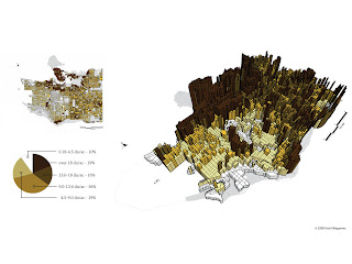
So this post shows an exploration in researched density map solutions from population density to public transportation. There's certainly some interesting possibilities, and I must admit, the idea of a dimensional solution completely skipped my mind. It's a bit more complex, but definitely a possibility.


Here are some images I've found that somewhat reflect the vague ideas of what an effective map design might look like at the moment.

Now I don't believe that the map will be viewable by the cyclist unless they come to a stop in their route. Safety first of course. But while the application is mapping their route and is in motion, the screen will likely stay dark to save battery or perhaps show the application logo as a tiny form of mobile advertising. But all the same, I'd like the map aesthetic to be simple and readable at a glance.  Commuters in particular have places to be, and the user shouldn't have to spend a long time attempting to orient themselves. Color itself should also be limited. Most of the maps use a color coding system to show a huge area, but I think my color system might be more limited in cases where the user is plotting their route down select roads. So the map might be a single neutral color and the route might be mapped in something more vivid.


I also really like the idea of pins, and that they in a way represent a tap, a touch, a plotting of location in an instant. So maybe pins will find their way into the map design as well.

And of course I can't look at maps without stopping by good ol' Nicholas Felton's website.


I've also continued my research into bike lanes and the many options when installing one. This website in particular was a great help in understanding the many types of bike lanes, as well as the standard dimensions one requires. I've yet to find however a source that takes you through the process in considering when and where a bike lane is chosen to be put in. Considering this I might have to call in to the department of Transportation personally. I'll try establishing contact within the week since they have no email adresses listed.

I have looked at a few other community websites however to help me further understand local bike community events and stores I was earlier unaware of. Particularly smaller local shops that provide not only cheap bikes and parts to the community, but classes on proper care, riding, and repair. KCBike.Info was a great source that I'll be keeping a close eye on. I would love to interview some people to get some insider opinions on our city's bike lanes and road system.

One post however drew my attention right away on this community website. It seem's that on August 17th of 2011 there was a meeting at the Crown Center downtown discussing UMB and the city's cooporation in bringing more bike lanes downtown, particularly to Grand St..

The article reads:

"UMB Bank and the City are kicking off a big project to make Grand a truly grand street with new sidewalks, streetscape, natural stormwater retention, crosswalks, bike lanes, and maybe even bike sharing. There is even talk of fancy separated bike lanes like ones popping up in Chicago, DC, and New York."

There are also many great sites such as Bikely.com that have a full list of mapped out commuting routes posted by local bike riders. It's good to see that even without an application with simple and easy route plotting functionality that cyclists are still uploading and sharing safe route information to one another.